

Back to Articles Micaela•Jan 26, 2026
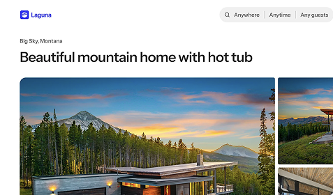
Designing Vacation Rental Property Pages That Drive Clicks, Page Views, and Bookings
If you want your vacation rental site to rank and convert, your design has to do more than look good. Google rewards sites that users engage with. Guests reward sites that feel easy, intuitive, and focused. The overlap between the two is a user experience built for conversion.
When a guest lands on your site, the decision starts instantly, often before they read a single word. 94% of first impressions are driven by design, and in just 0.05 seconds, visitors form an opinion about your brand based solely on how your site looks.
That first glance carries real weight: 75% of a site’s credibility comes from how professional and trustworthy it feels. Beautiful design doesn’t just attract attention, it keeps it. 59% of users prefer browsing well-designed websites, and 79% won’t return at all if the experience feels visually off.
In short, design isn’t decoration, it’s the foundation of trust, confidence, and bookings.
This guide breaks down the highest-impact design decisions that drive:
More clicks
More page views
Lower bounce rates
More bookings
And most importantly: why Google understands those signals as ranking-worthy.
Design for engagement first
Search engines don’t rank websites, they rank user behavior.
When guests:
Click into multiple property pages
Spend time browsing galleries
Scroll instead of bouncing
Complete bookings
Google learns that your site is valuable. Every design choice below is about guiding attention toward engagement, not distractions.
1. Put the property gallery at the top of the homepage
Why it works
Photos are the primary decision driver in vacation rentals. Guests don’t want to “learn”, they want to browse.
How to do it
Place a property gallery immediately below (or replacing) the hero
Use large, clickable cards with:
One strong image
Property name + location
Make the entire card clickable
What it drives
More clicks on property pages
Higher pages-per-session
Lower bounce rates
This is one of the strongest engagement signals you can send to Google.
2. Keep the homepage hero to ~⅓ of the screen
Why it works
Full-screen heroes stop momentum. A smaller hero encourages scrolling, which is an engagement signal.
How to do it
Limit hero height to ~30–35% of the viewport
Include:
One clear value proposition
A soft CTA (“Explore homes”)
Let the property gallery appear immediately below
What it drives
Faster scrolling
Immediate exposure to listings
Increased session depth
Scrolling is a positive behavioral signal for both UX and SEO.
Further reading:
3. Simplify navigation to remove exit paths
Why it works
Every extra menu item is a chance to lose a guest.
How to do it
Limit your primary navigation to:
Homes (or Destinations)
About (optional)
Contact
Avoid blogs, policies, FAQs, or dropdowns in the main nav.
What it drives
Focused browsing behavior
More property page engagement
Fewer early exits
Less choice = more action.
4. Design property pages for scanning, not reading
Why it works
Guests skim. Your page needs to communicate value in seconds.
How to do it
High-converting property pages follow this order:
Image gallery
Property name + location
Key stats (sleeps, beds, baths)
Short description (3–5 lines)
Amenities (grouped + scannable)
Calendar + pricing
Clear booking CTA
Use icons, bullets, and spacing—not long paragraphs.
What it drives
Longer time on page
Higher intent before pricing
More confident booking decisions
Clear structure reduces friction.
5. Streamline checkout to remove distractions
Why it works
Most booking drop-off happens at checkout, not on the property page.
How to do it
Minimize steps and fields
Remove secondary CTAs and links
Show total price clearly and early
Keep one primary action: Book now
What it drives
Higher booking completion rates
Lower abandonment
Strong trust signals
A clean checkout directly impacts revenue.
6. Keep the homepage intentionally simple
Why it works
Your homepage is a routing page—not a brochure.
How to do it
Limit the homepage to 1–3 sections:
Property gallery
Clear value proposition
Contact/support access
If it doesn’t drive someone to a property page, remove it.
What it drives
Faster engagement
More listing clicks
Stronger SEO engagement signals
Simple pages convert better.
The takeaway
The best-performing vacation rental sites don’t overwhelm guests—they guide them. Every design decision should answer one question:
Does this increase clicks, page views, or bookings? If the answer is no, it’s hurting both conversions and rankings.
Design for engagement, and both guests and Google will follow.
Want these conversion principles built in automatically?
Wander Sites is designed around proven UX patterns that drive more clicks, deeper engagement, and more direct bookings right out of the box. No custom design work required.
Get started free at wander.com/sites.
Download the app
By signing up, you agree to our Privacy Policy and Terms of Service.